How far can the idea be simplified?
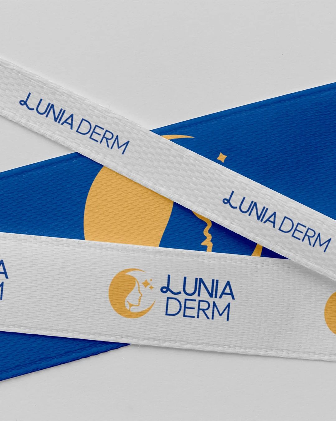
We develop the logo not as a form on its own, but as a distinctive mark that carries the brand’s character with the least possible gesture.
How far can the idea be simplified?
We develop the logo not as a form on its own, but as a distinctive mark that carries the brand’s character with the least possible gesture.
In what tone does the brand speak?
Typeface, hierarchy, and rhythm of use decide how seriously, warmly, or directly the brand will speak.
Where does distinction begin?
We build the color system not as a palette alone, but as a working order that separates products, content, and levels of information.

How is character protected?
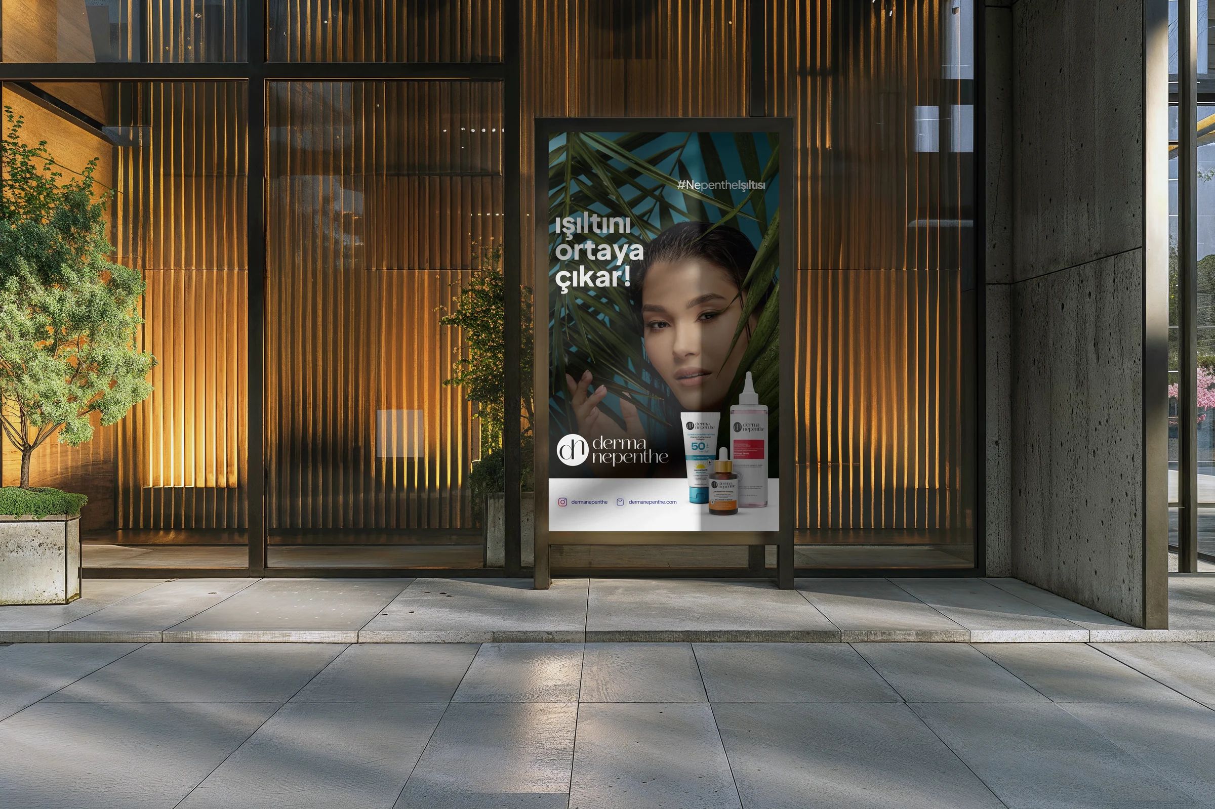
Templates and principles of use let the identity carry the same quality across different teams and channels.
An identity system does not make every application look the same; it lets them move from the same thinking. It separates what stays fixed from what can change, and it makes it easier for the team to decide consistently when new needs appear.
We can. We first decide which uses the logo must serve, and we build the necessary scope around the parts the brand will actually use.
Yes. If the existing mark carries the brand’s character and its needs of use, we can keep it and reorganize the typography, color, and application system.
Depending on the scope, logo packages, color and type definitions, core applications, templates, and a usage guide are prepared. The delivery list is clarified at the start of the work.
We prepare the guide and templates not only for designers, but with enough clarity that teams producing content and applications with the brand can make the right decisions.