Works
ANC Trading
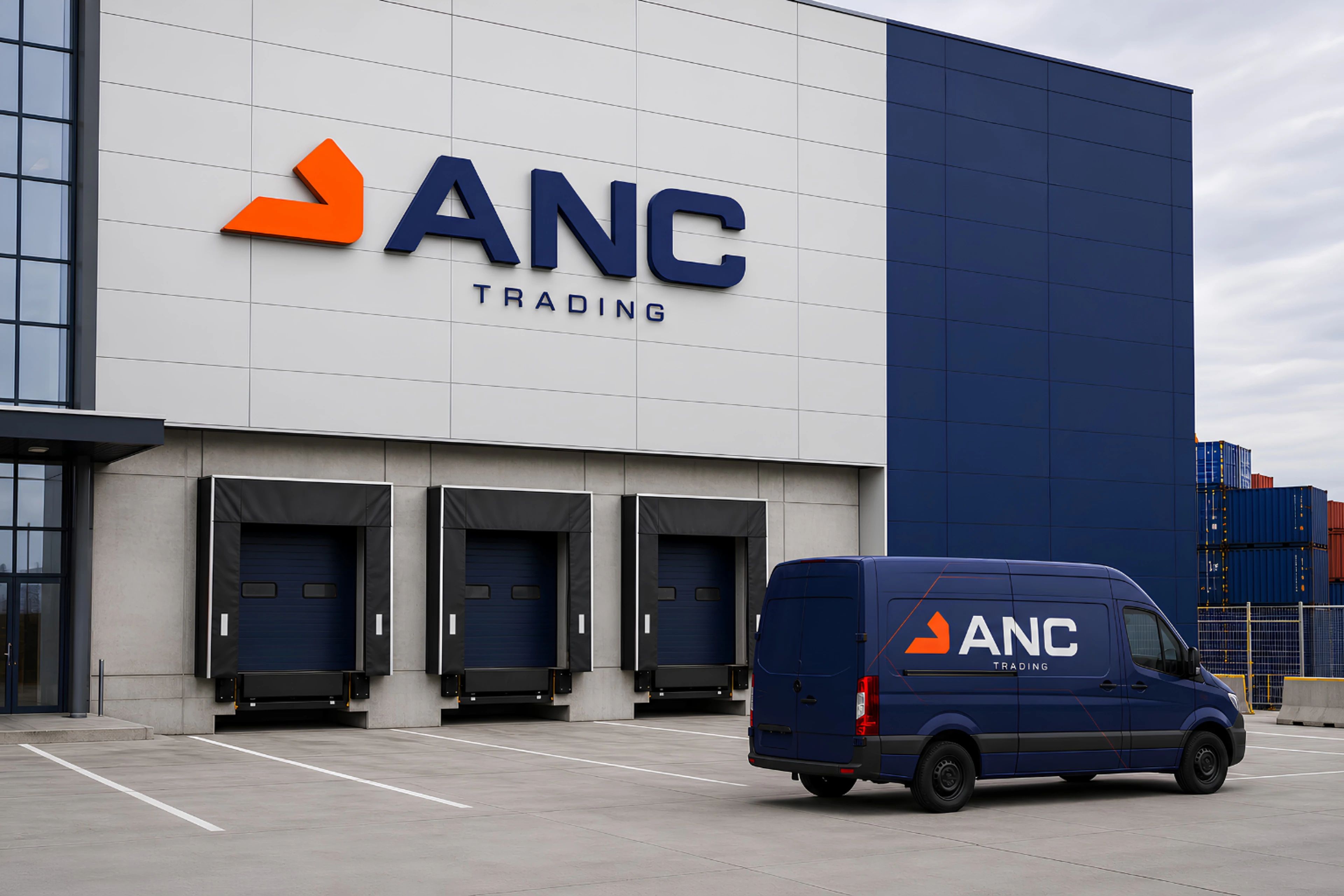
For trade that moves across borders, we drew a mark that points forward. ANC Trading’s orange symbol keeps its direction from business card to warehouse.
- Company
- ANC Trading
- Project year
- 2026
- Services
- Branding
Online versionmiova.com.tr/en/works/anc-trading
One identity, designed to work across borders.
We began ANC Trading’s new identity with the ideas of direction and movement. The mark, colour palette and typographic system were designed to remain legible from a business card to a warehouse facade.
Beyond Borders. Beyond Expectations.
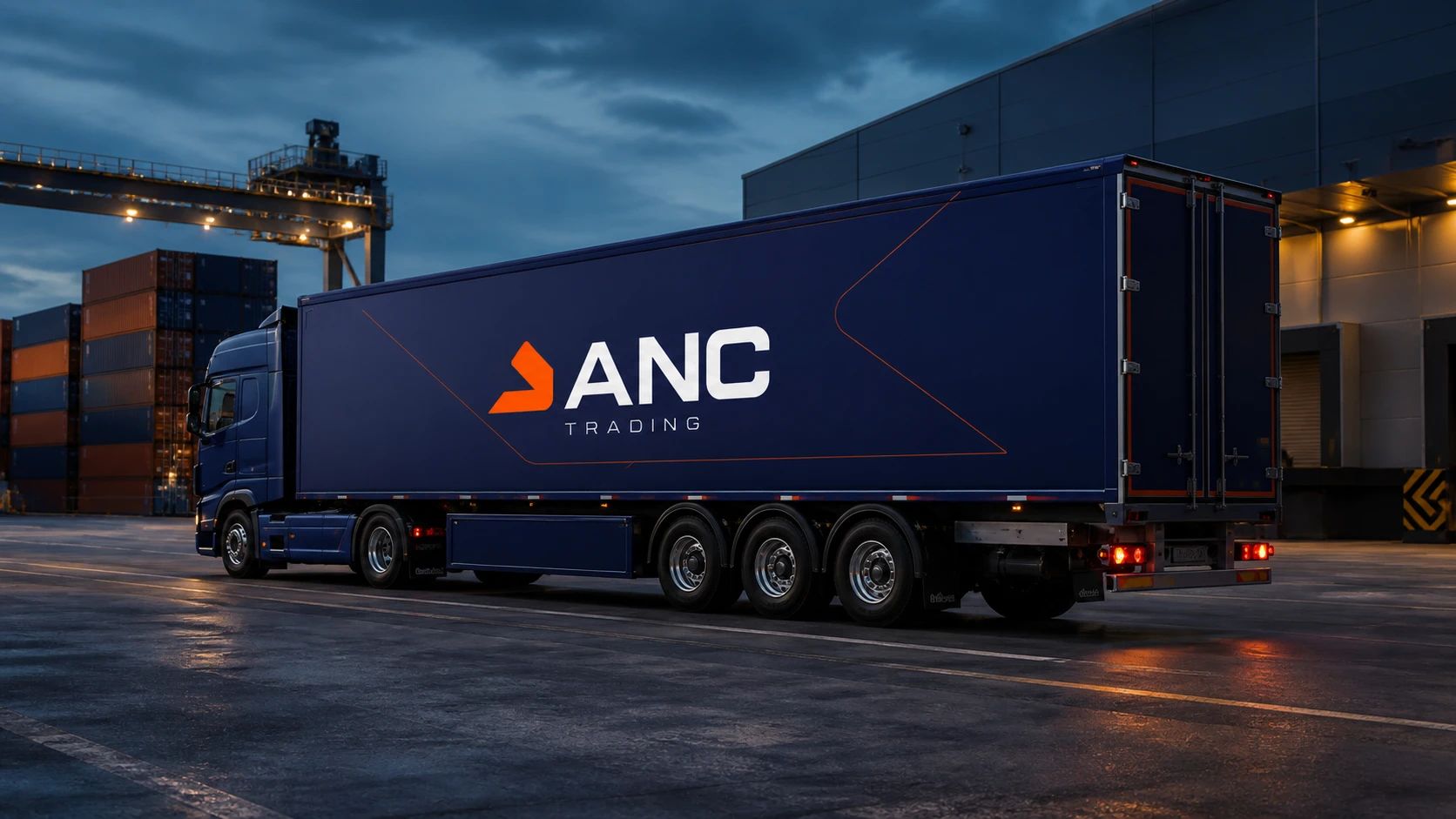
A clear direction
for the ANC name.
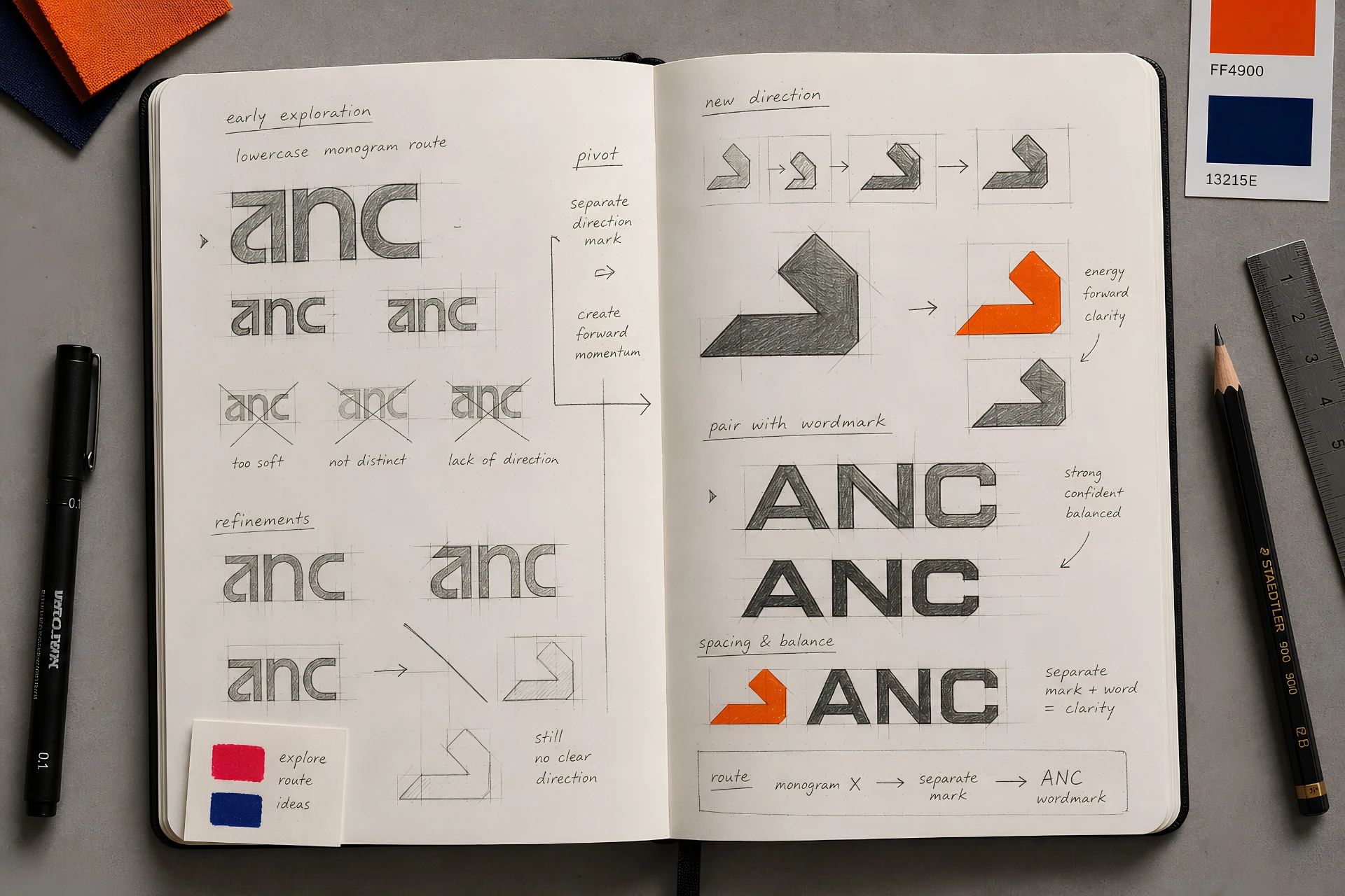
We distilled ANC Trading’s trade across borders into a geometric mark that points forward. Moving from a lettered monogram to a separate direction mark, the design process gave the brand a symbol recognised with the same confidence on paper and on site.

Corporate Identity
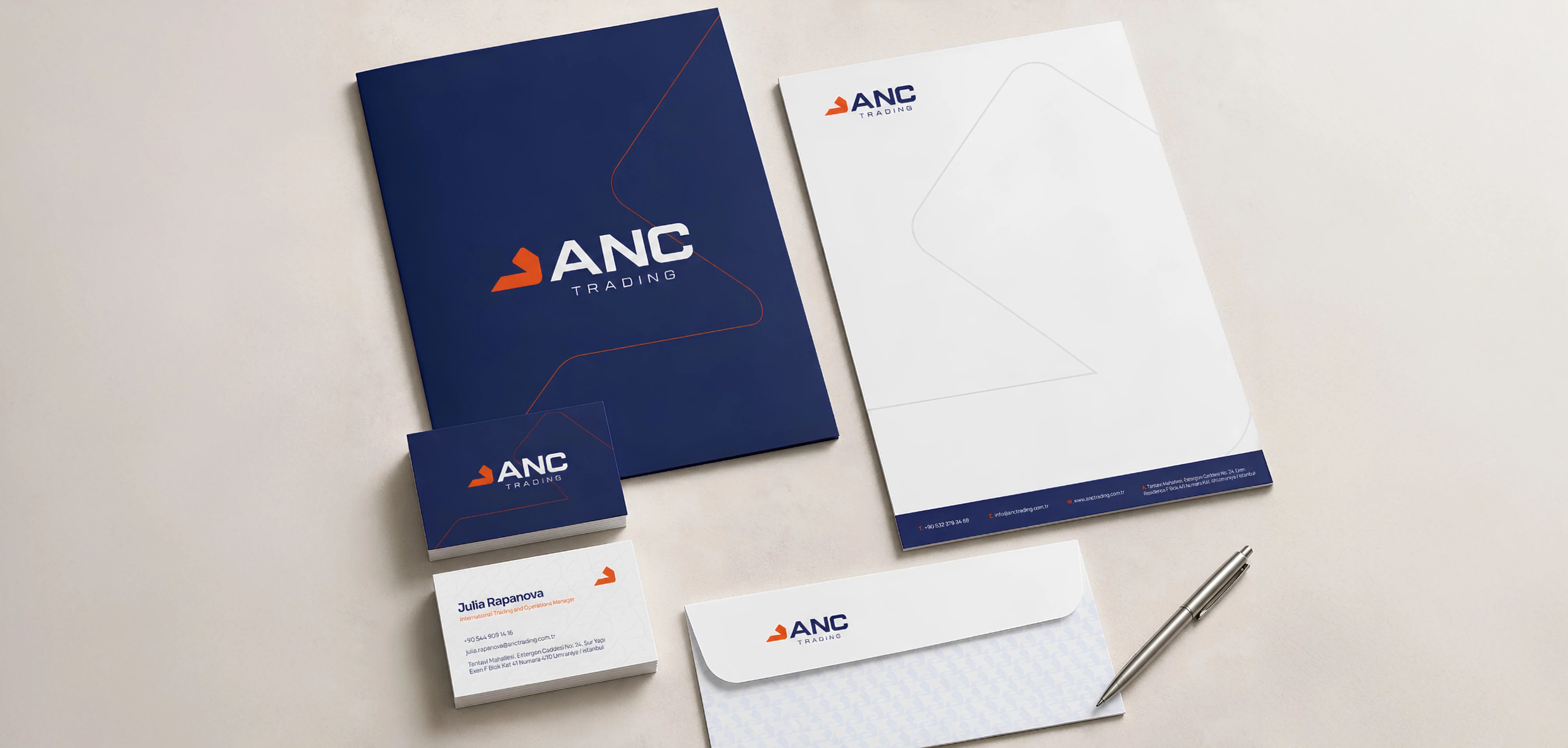
Pairing an orange mark with a navy logotype, we built a corporate identity system that scales from business cards and folders to letterhead and warehouse facades.




miova.com.tr