
Works
Qatra
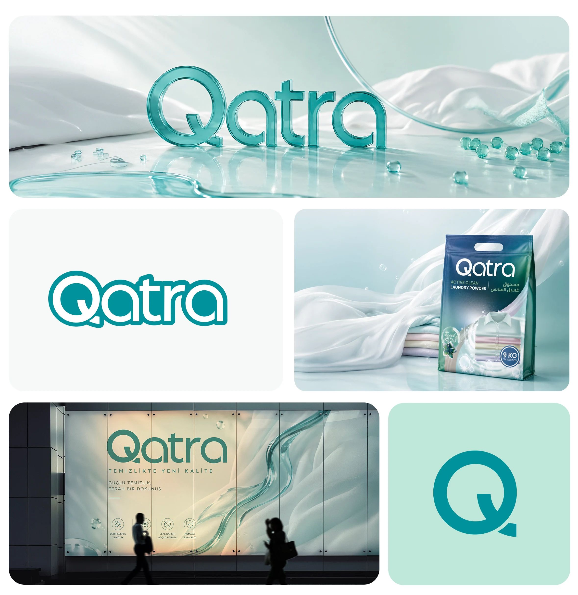
On the shelf, color reads first, then use. For Qatra’s laundry, dishwashing and floor care range, we made the identity, packaging and a bilingual catalog.
- Company
- Qatra
- Project year
- 2026
- Services
- Branding, Corporate Identity, Packaging Design, Product Catalogs
Online versionmiova.com.tr/en/works/qatra
- Qatra
- 2026
From logo to packaging, a new product family.
We designed Qatra’s brand identity to fit a wide product range. By bringing the logo, packaging and catalog together around a shared visual language, we gave the brand an identity that stands out on the shelf and stays consistent across product categories.
Corporate Identity
We designed the logo to read just as clearly on any background.

Packaging Design
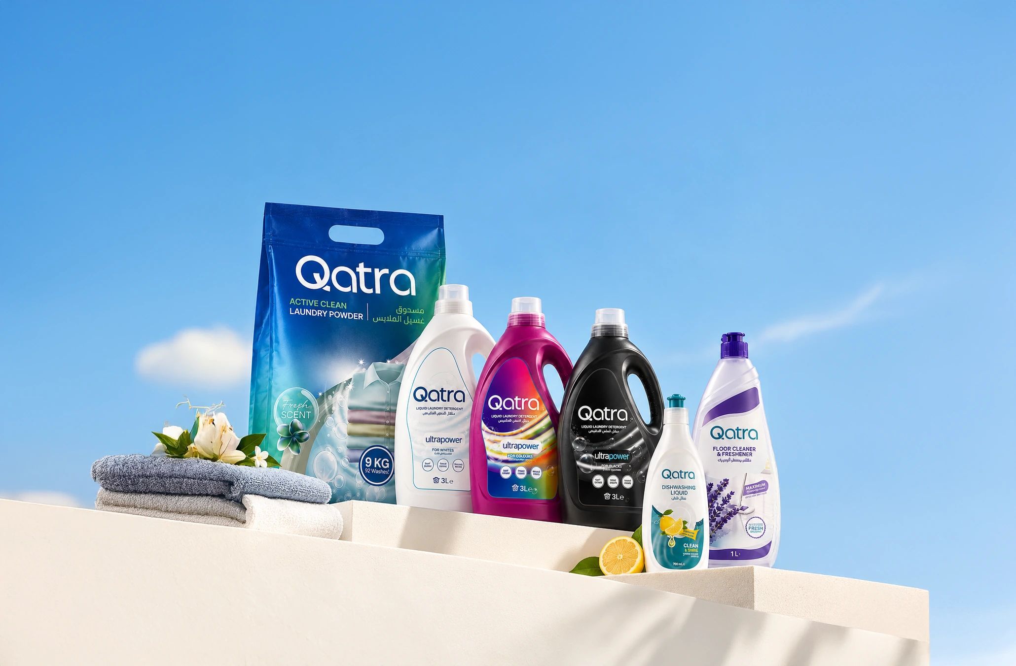
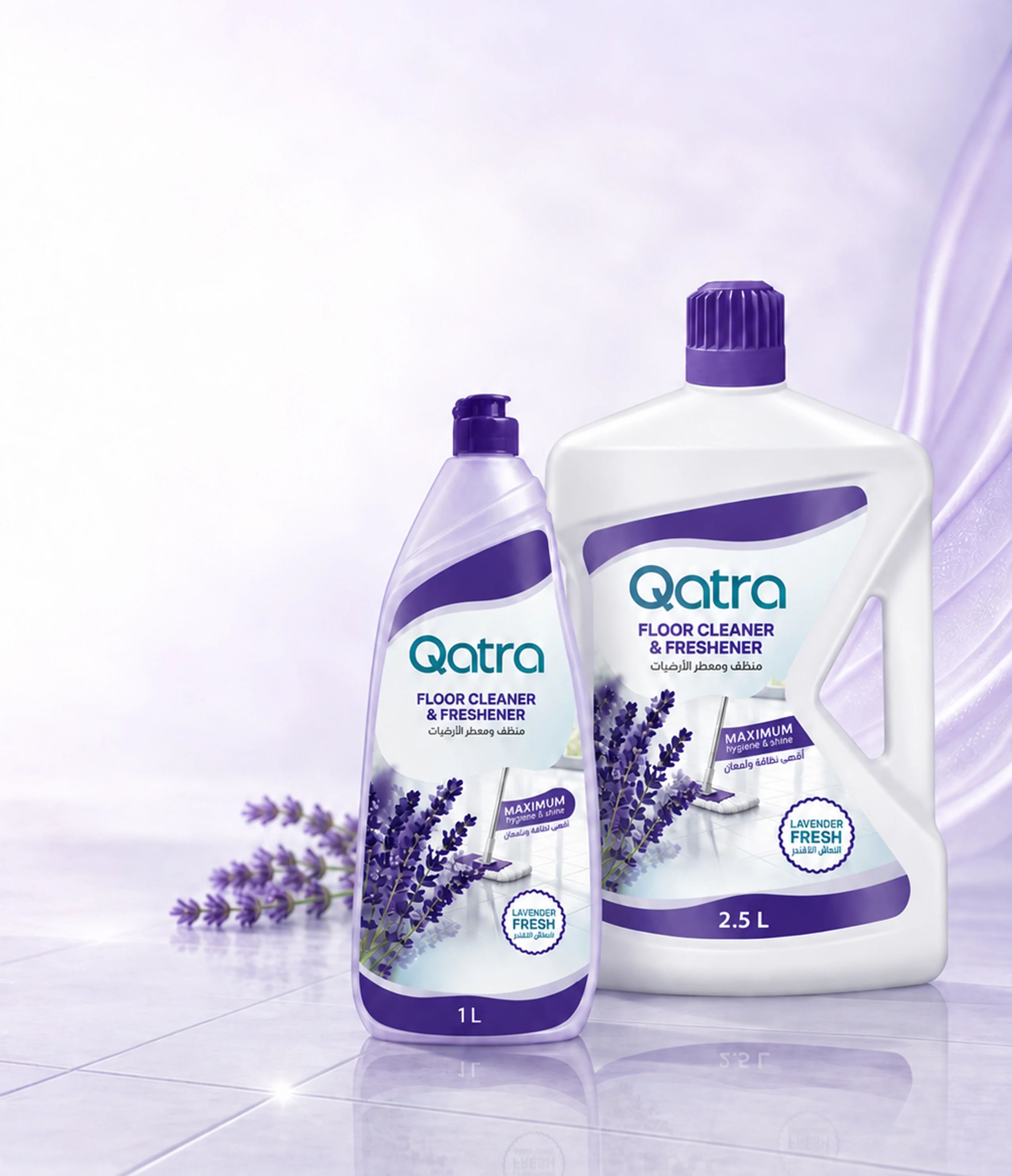
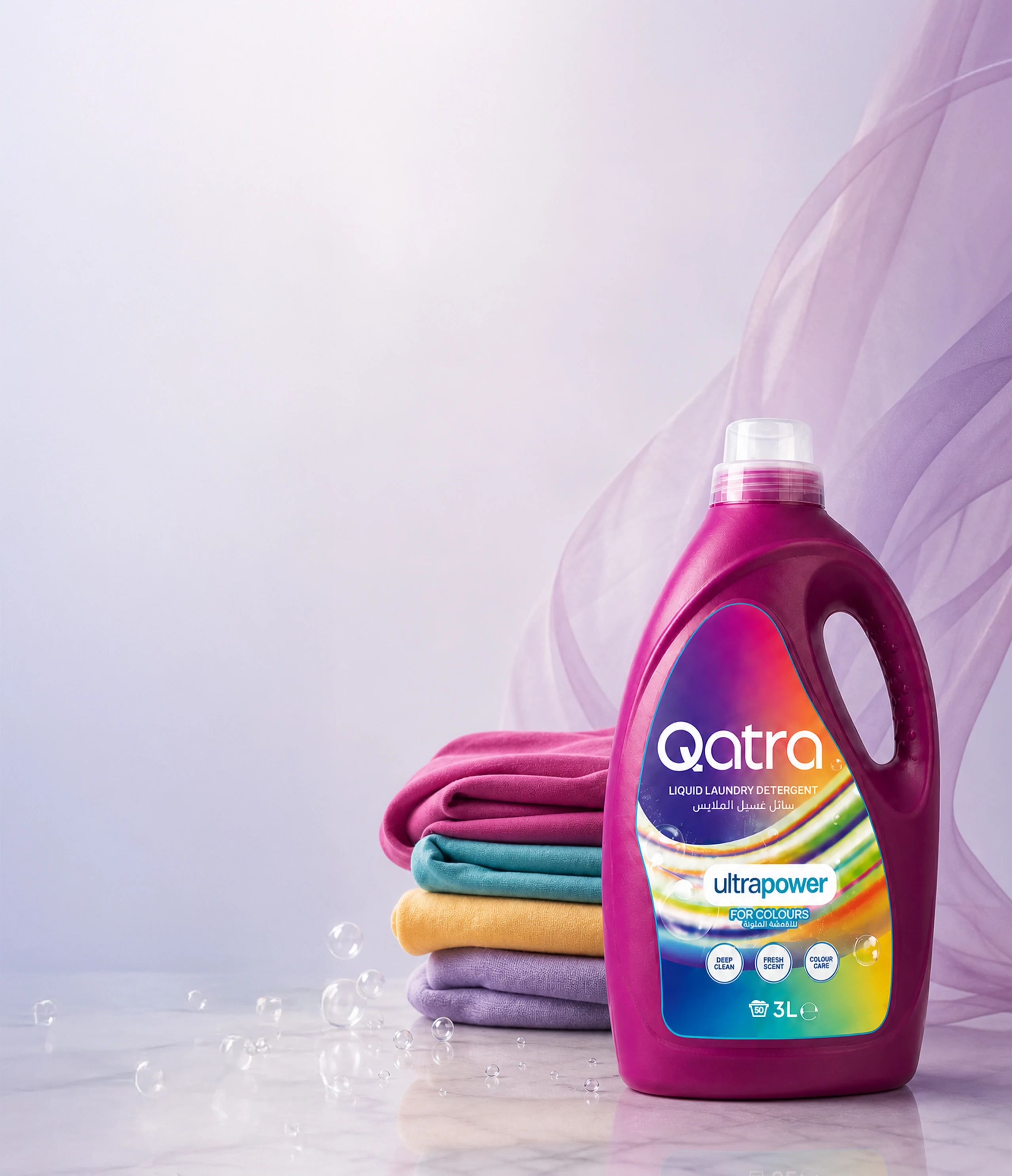
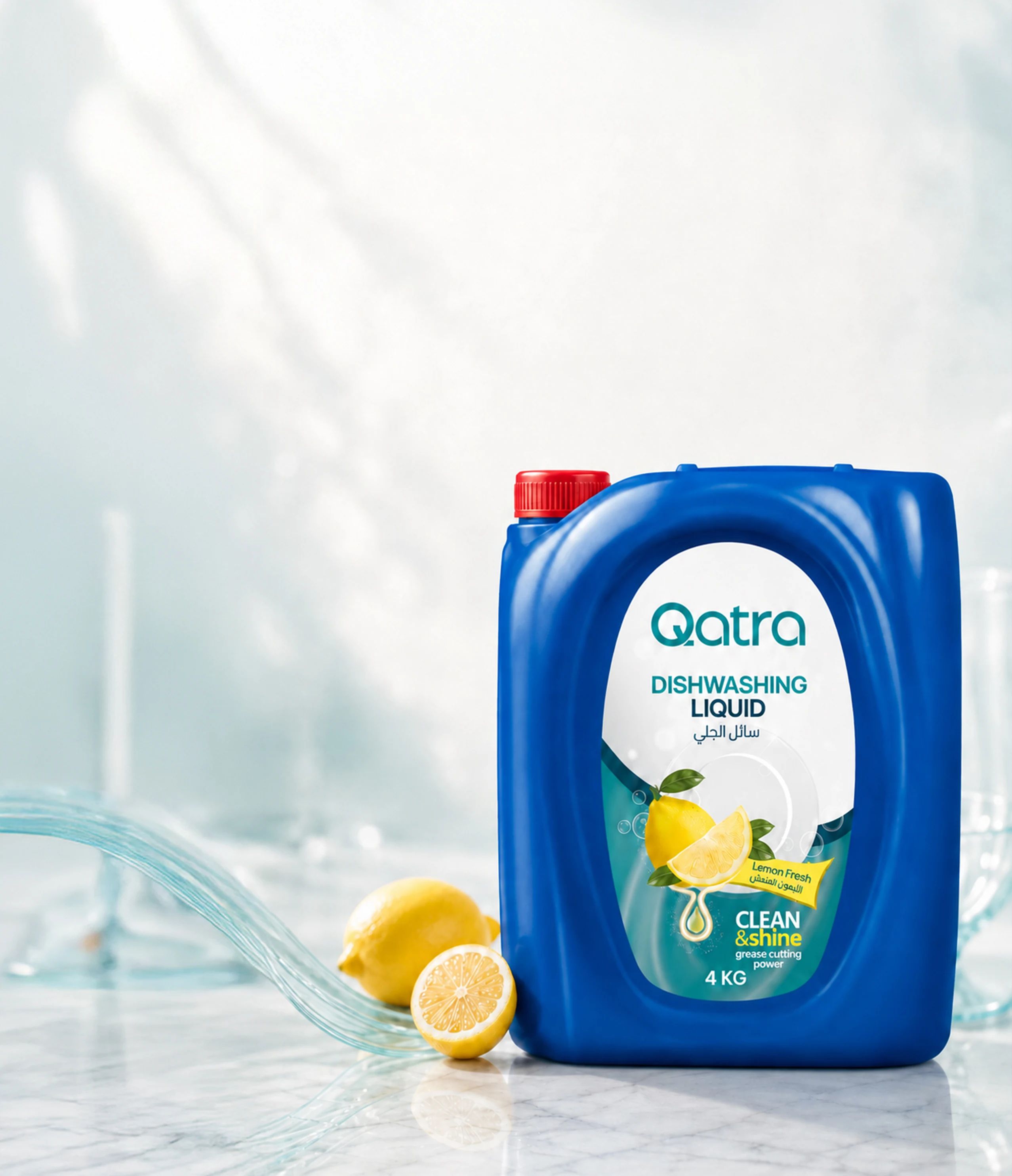
For Qatra’s wide product range, we designed packaging that serves both shelf visibility and product choice. Colors, imagery that highlights where each product is used and a clear information layout set every product apart, while the whole series keeps the brand’s shared identity.

Catalog
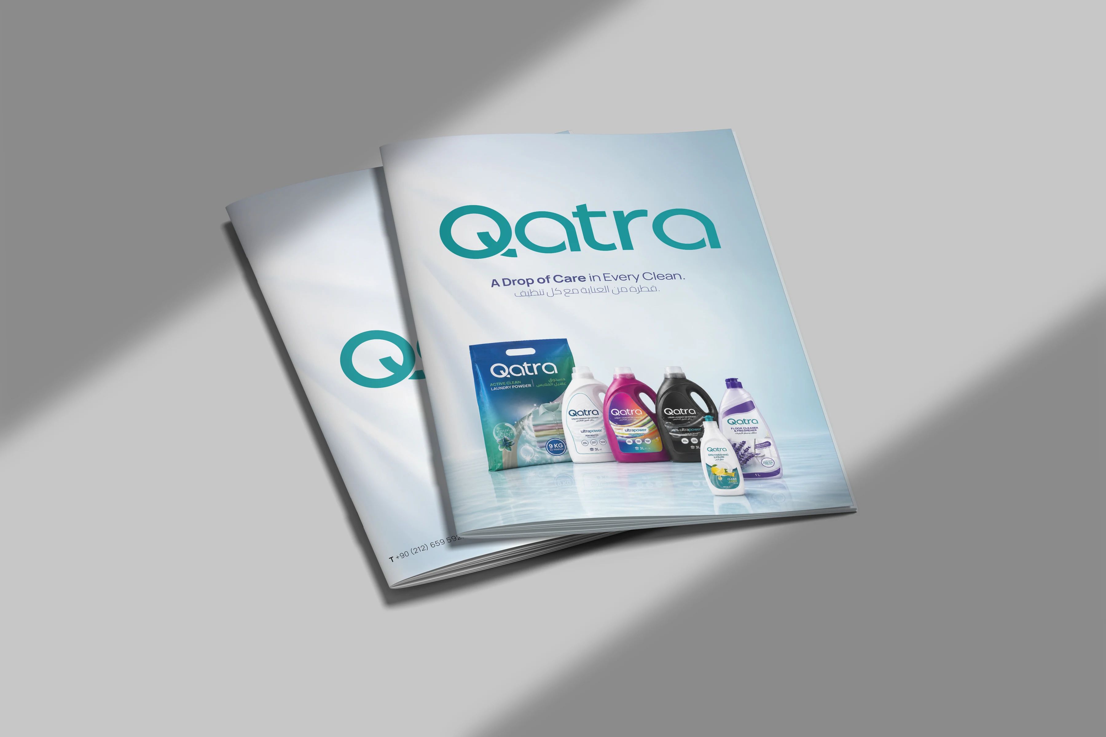
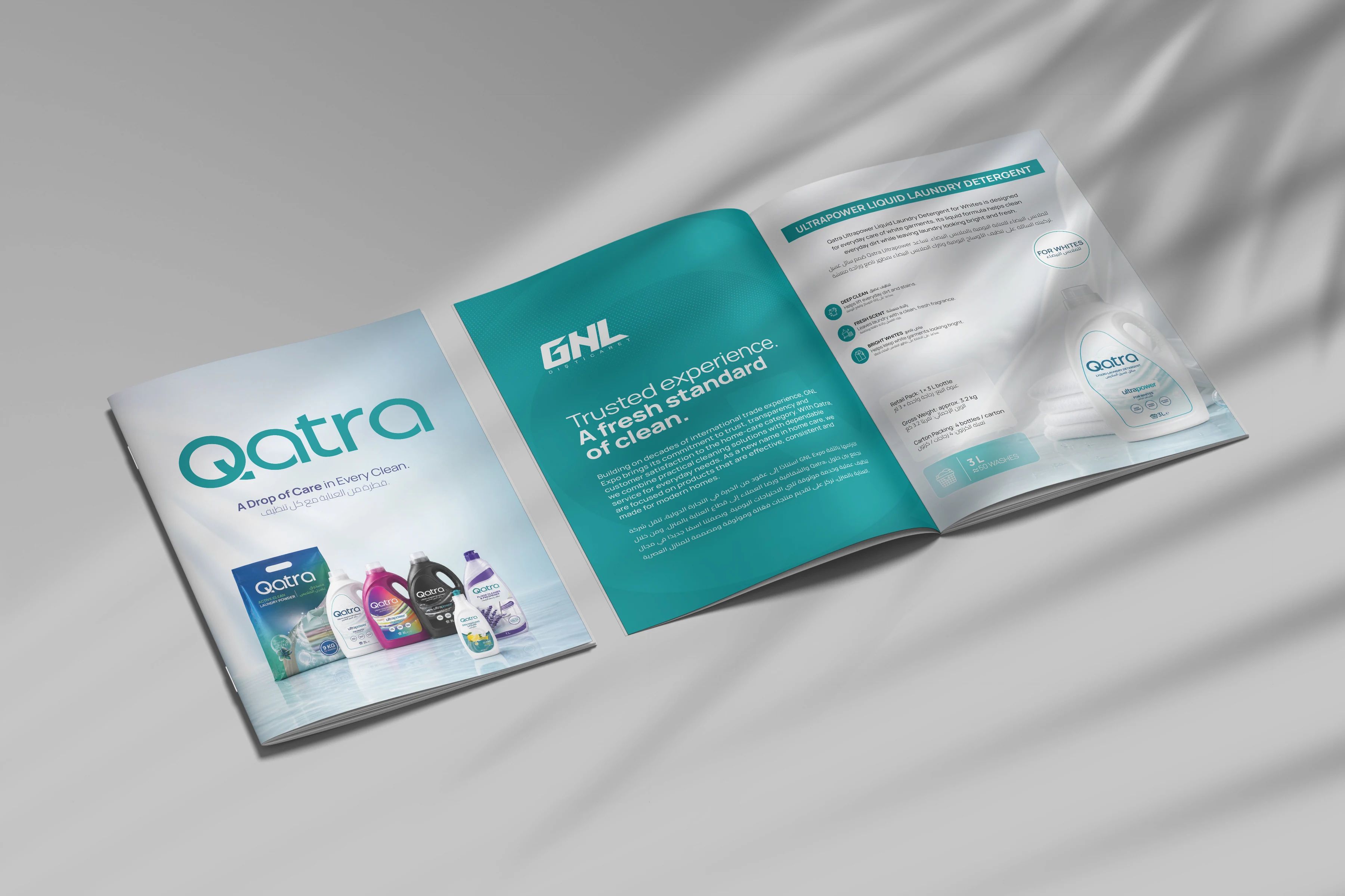
We brought Qatra’s product range together in a catalog where product features and ordering information are easy to review, with a simple, orderly page structure that keeps the brand’s visual identity and makes information easy to reach.



miova.com.tr