
Works
ABL Yapı
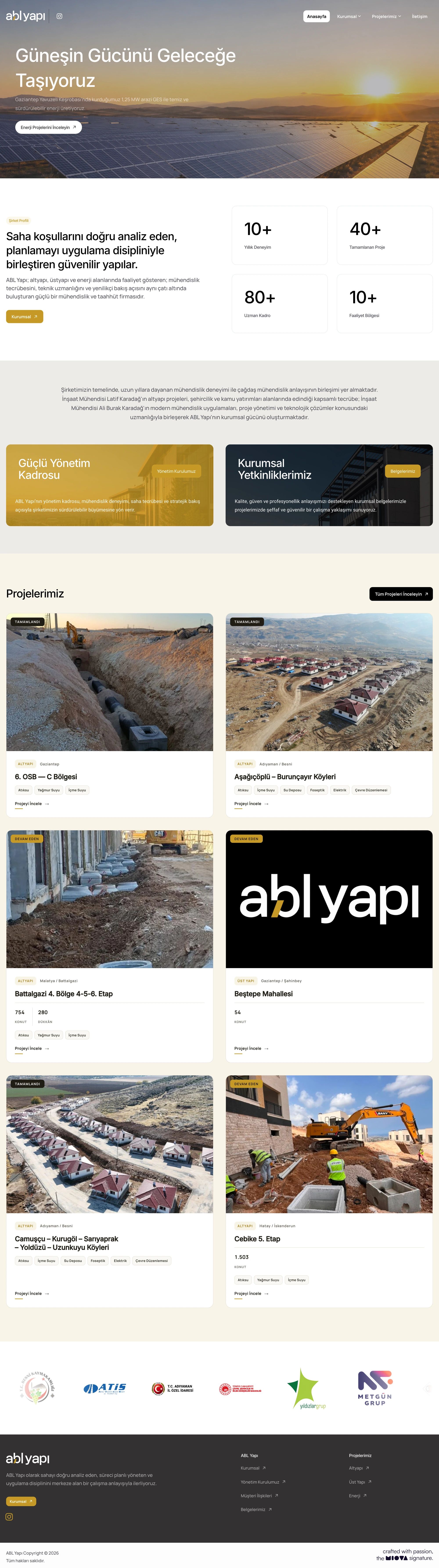
So every site carries one signature, ABL Yapı’s identity rests on its logo and a yellow accent. Its website shows projects by location, status and scope.
- Company
- ABL Yapı
- Project year
- 2026
- Services
- Branding, Corporate Identity, Social Media Design, Interface, Interaction and Websites
Online versionmiova.com.tr/en/works/abl-yapi
- ABL Yapı
- 2026
One identity for work that runs from infrastructure to energy.
For ABL Yapı, we designed the whole brand language, from the logo and printed identity to social media and the website, bringing work across different fields under one shared visual language that reflects engineering discipline and trust.
From housing to solar plants, the same signature on every site.
We designed a simple system built on the logo and a yellow accent that makes ABL Yapı’s signature recognisable at first glance on every site.
Corporate Identity
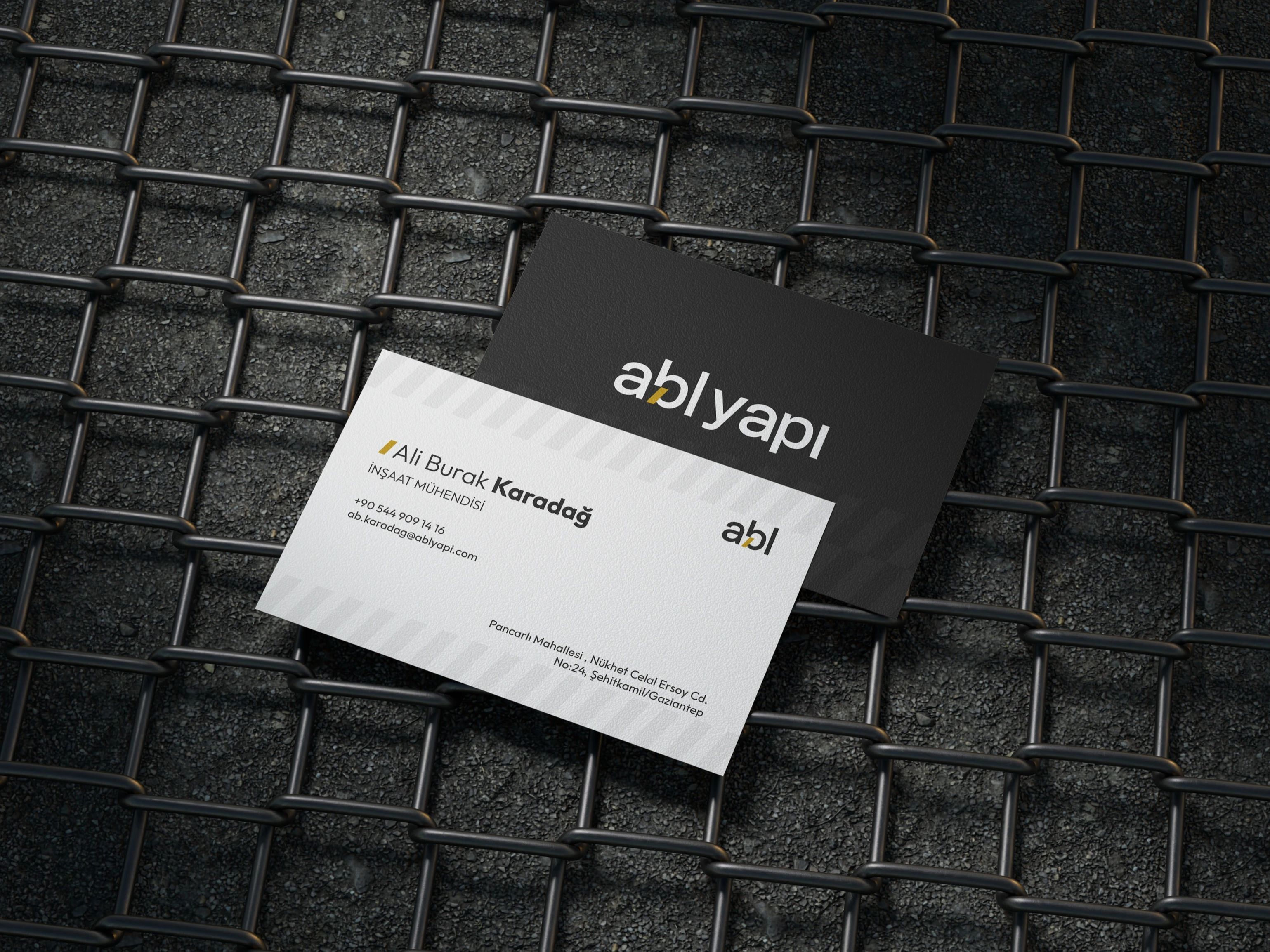
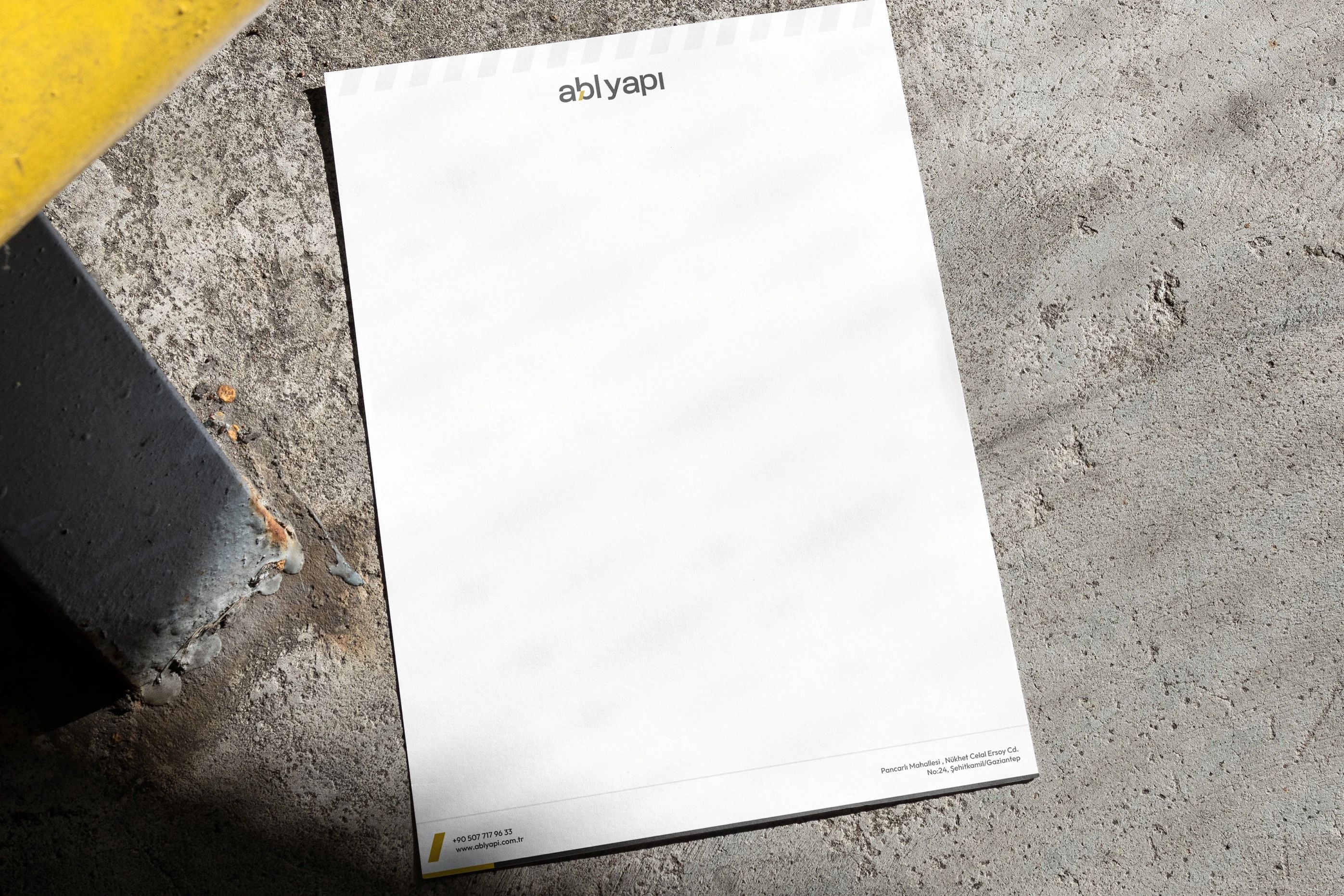
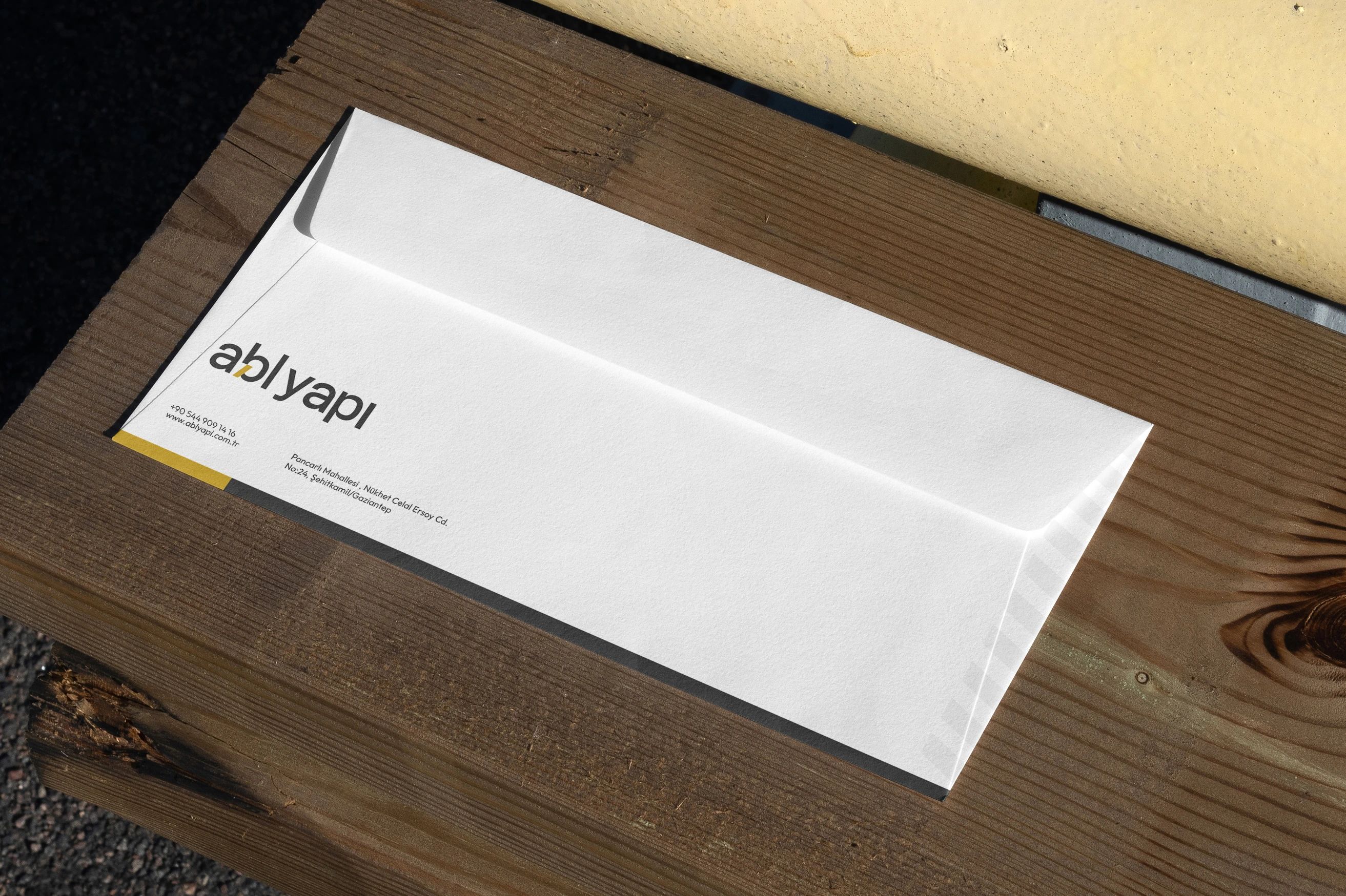
Bringing together the logo, the yellow accent and graphic elements drawn from the language of the building site on business cards, letterhead and envelopes, we gave the firm’s correspondence an orderly look that inspires trust.

Social Media
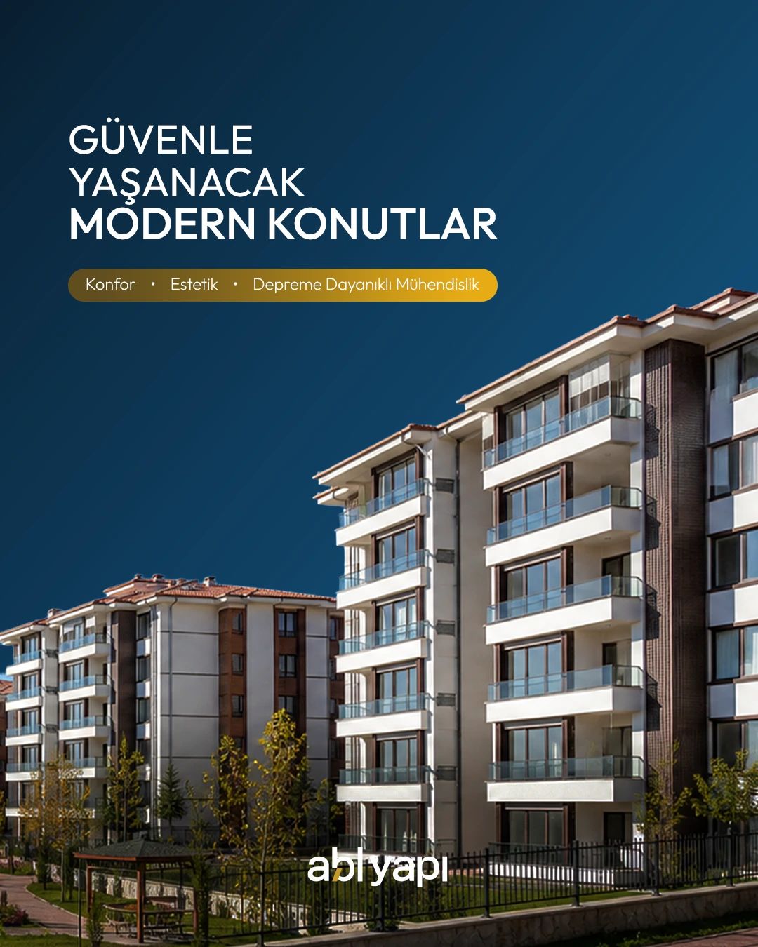
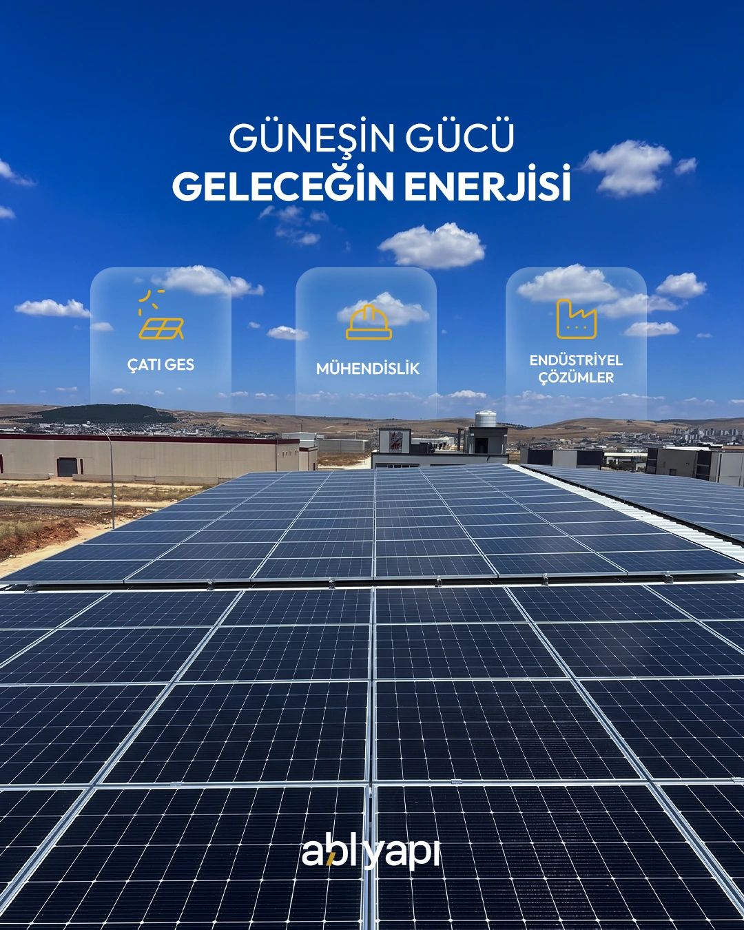
We designed social media posts that present housing, solar energy and infrastructure work with photographs from their own sites and short, clear headlines, bringing the firm’s three lines of work into one consistent layout.
 ABL Yapı
 ABL Yapı
 ABL Yapı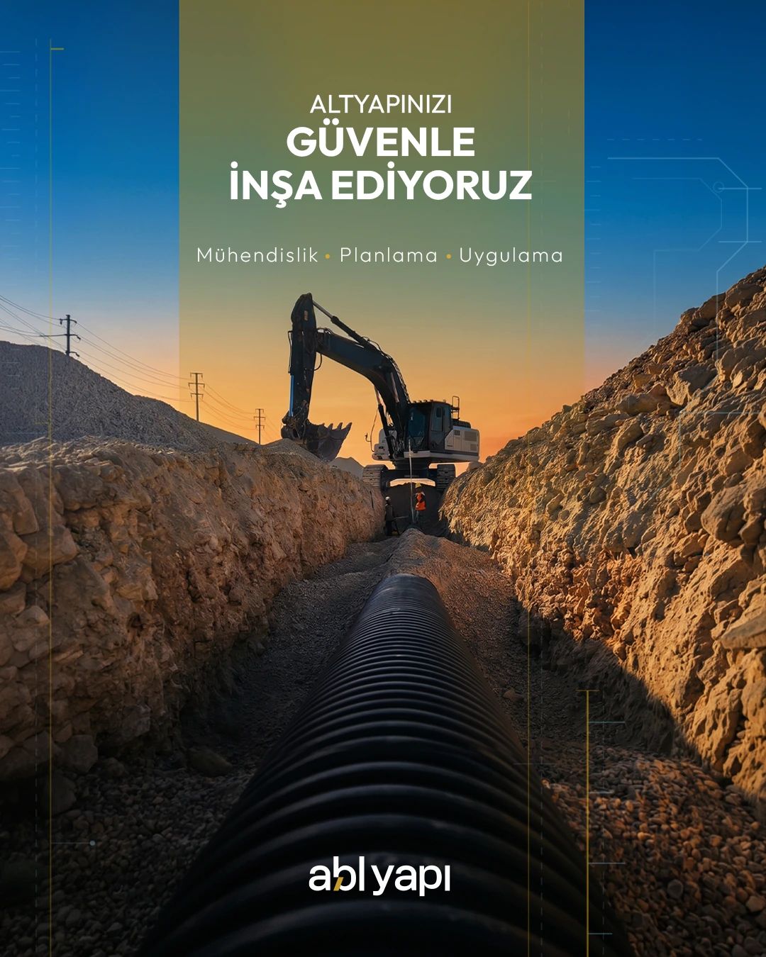

Website
We designed and developed a website that presents the firm’s experience in a simple, orderly structure, making every project easy to explore by location, status and scope.



miova.com.tr