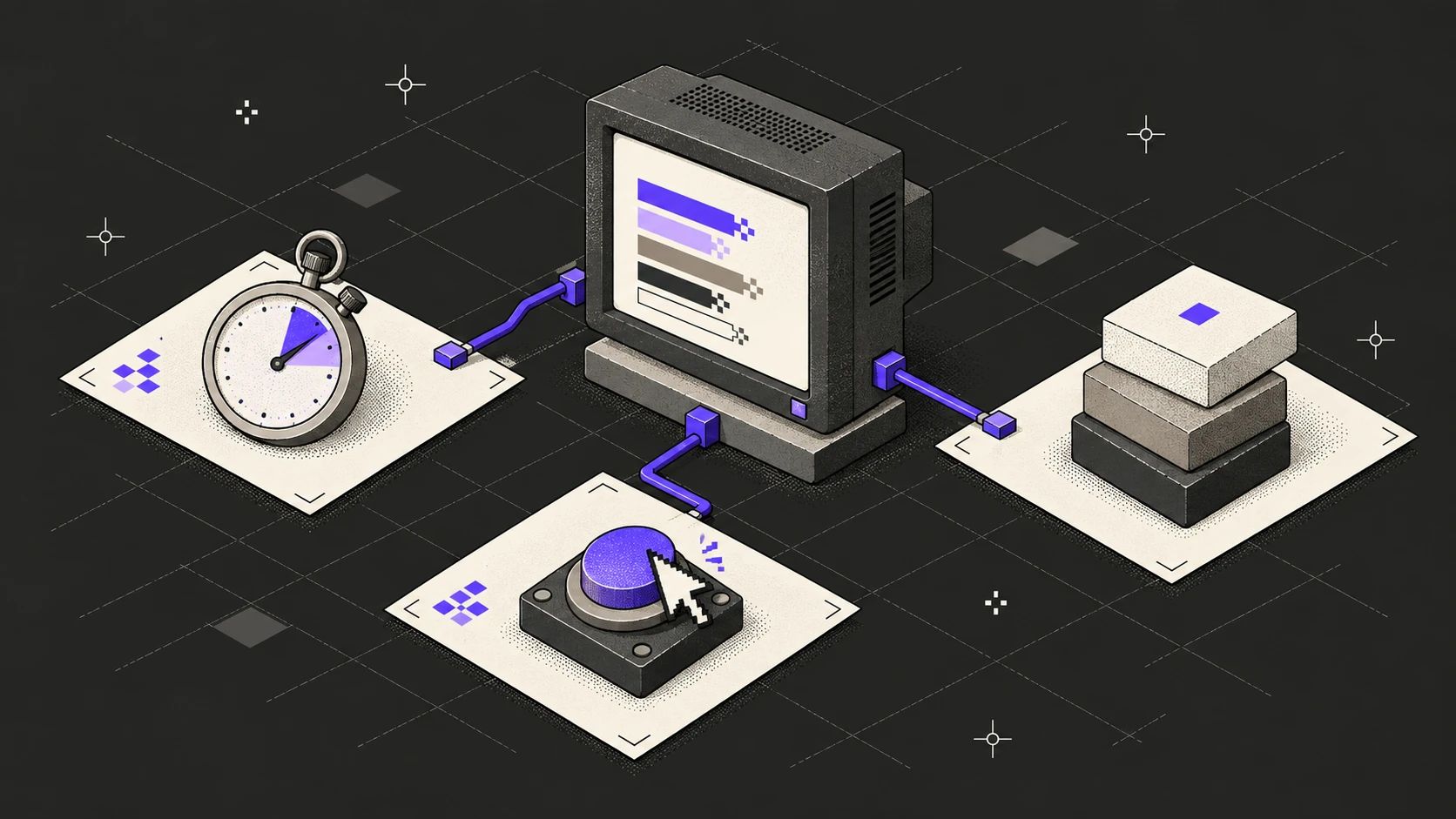
A website’s first impression isn’t the hero image; it’s the wait before the hero image. People don’t time that wait with a stopwatch, they feel it: the page is “heavy”, the button is “unresponsive”, the text “jumps”.
Google’s Core Web Vitals turn those feelings into three measurements. We don’t treat them as a checklist handed to developers at the end of a project, but as the result of design decisions made in the very first sketch. In this post we explain what each one means on screen, with a small demo in the middle so you can feel the delay yourself.
Three metrics, three questions
- LCP (Largest Contentful Paint) — “Is it here?” The moment the largest content element, usually the hero image or the main headline, is painted.
- INP (Interaction to Next Paint) — “Did it hear me?” How long it takes for the screen to visually respond after a click, tap or key press. It replaced FID in March 2024.
- CLS (Cumulative Layout Shift) — “Does it stay put?” The sum of unexpected layout shifts while the page loads. The button that slides away right as you tap it is CLS at its most familiar.
Google evaluates these at the 75th percentile of real-user data: if three out of four visits stay under the threshold, the page counts as “good”.
Thresholds for “good”
- LCP
- 2.5 s
- Main content should be painted within 2.5 seconds for at least 75% of visits.
- INP
- 200 ms
- The first visual response to an interaction should stay under 200 milliseconds.
- CLS
- 0.1
- The accumulated layout shift score should stay below 0.1 over the page’s lifetime.
Source: web.dev — Web Vitals
Waiting has a cost
The business impact of speed has been measured for years. Research by Google and SOASTA on mobile sites in 2017 shows how the probability of a visitor leaving without doing anything grows as load time increases.
Data
Bounce probability rises as load time grows
Increase in the probability of a visitor bouncing, compared with a mobile page that loads in 1 second.
| Category | Increase in bounce probability |
|---|---|
| 1 → 3 s | +32% |
| 1 → 5 s | +90% |
| 1 → 6 s | +106% |
| 1 → 10 s | +123% |
Three seconds sounds short, yet it raises the probability of a bounce by a third. It works the other way too: in the Milliseconds Make Millions report Deloitte prepared for Google, improving mobile site speed by just 0.1 seconds increased conversions by 8.4% on retail sites and 10.1% on travel sites.
INP: the gap between a click and a response
The browser runs most of a page’s JavaScript on a single main thread, the same thread that paints the screen. If heavy work starts right after a click, the browser can’t update the screen until that work is done: the button looks untouched, animations freeze.
INP measures exactly that gap: the time from an interaction to the next paint. In the demo below we genuinely keep the main thread busy. Pick a delay and press the button.
Interactive
Feel the delay
Pick 600 ms and press “Add to cart”; if the counter on the right freezes, the main thread is blocked. Then turn on “instant feedback” and try again with the same delay.
Update the screen right after the click, do the heavy work after.
Click the button to see the measurement.
INP thresholds: ≤ 200 ms good · ≤ 500 ms needs improvement · above is poor
This interactive example isn’t part of the printed version; try it in the online version of this page.
What changed?
Both attempts did the same work and it took the same time. Only the order changed. With feedback on, the button switched to its pressed state first, the browser got a chance to paint a frame, and the heavy work started after that. Since INP measures time to the next paint, the score moved into the good zone without the work itself getting any shorter.
In practice it comes down to one rule: acknowledge first, work later.
- Update the screen immediately on click: a pressed state, a loading indicator, an optimistic UI.
- Break up long tasks and let the browser breathe in between:
scheduler.yield(), orsetTimeoutwhere it isn’t supported. - Move truly heavy computation to a Web Worker so the main thread stays with the screen.
- Don’t attach bundles of JavaScript to every interaction. We built this site with Astro: pages ship without JavaScript by default, and interactive parts like the demo above load as their own small components.
LCP and CLS are won at the design table
Most LCP and CLS problems start in design, before any code is written.
The hero image
The largest element is often the hero image. Serve it as AVIF or WebP at sizes that match the screen, and don’t lazy-load it. File weight is a design decision too: instead of a full-screen photo, strong typography with a light texture is often both faster and more distinctive.
Typefaces
Every weight is a separate file. Designing with two weights instead of four is a direct speed gain. Loading the right subset for the language you serve (latin-ext for Turkish, for example) keeps characters like “ş” or “ğ” from arriving in a fallback font and making the line jump.
Reserving space
Give images, videos and embeds a width and height or an aspect-ratio. Announcement bars and cookie notices should overlay the page, not push the content down.
Motion
Animate only transform and opacity; neither forces the browser to recalculate layout. We fixed the stutter on mobile in the cat game on our own 404 page by moving it from left/top to transform.
You can’t improve what you don’t measure
Lab tools like Lighthouse take a single measurement in a controlled environment and are ideal for finding problems. Google’s assessment, however, is based on field data collected from real users, which makes the Core Web Vitals report in Search Console and the Chrome UX Report the real scorecard.
One more thing: test the site on a mid-range Android phone over mobile data, not on a laptop with fiber. That’s where most of your users are.
Speed isn’t a feature added after launch. Which image, which typeface and which interaction make it onto the page is decided in the first sketch. That’s where the decision is made, and that’s where speed is cheapest to win.
How was this post?