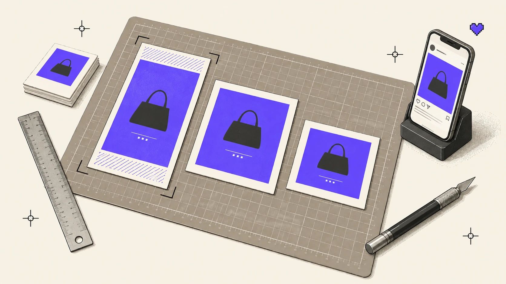
A social media design isn’t seen on the screen it was designed on; it’s seen inside the platform’s frame. A profile name on top, like buttons below, a progress bar in the corner and, on the profile page, a small cropped preview. Designing without that frame in mind means hiding your most important line under a button.
In this post we explain the logic of formats, safe zones and cropping, with a previewer in the middle where you can try the same design in different formats.
Formats
On Instagram, a design lives at four basic sizes:
- 1:1 square post: 1080 × 1080 px
- 4:5 portrait post: 1080 × 1350 px
- 9:16 Stories and Reels: 1080 × 1920 px
- 3:4 profile grid: The post’s preview on the profile page
Same width, different space
In the feed, every post fills the width of the screen; height is what the format decides. That’s why vertical formats take up more space on screen while scrolling, and stay there longer.
Data
Vertical formats take more room in the feed
Height of each format at a width of 1080 px.
| Category | Height |
|---|---|
| 1.91:1 landscape | 565 px |
| 1:1 square | 1,080 px |
| 4:5 portrait | 1,350 px |
| 9:16 full screen | 1,920 px |
A 4:5 portrait post takes up 25% more vertical space than a square post of the same width. For a campaign visual that wants to own most of the screen, that difference isn’t small.
Safe zones
Stories and Reels are full-screen formats, but the whole screen isn’t yours. The profile name and progress bar sit on top, the reply field or caption at the bottom, and in Reels the like and comment buttons run down the right side.
Stories safe zone
- Top margin
- 14%
- Keep it clear of text and logos for the profile name and progress bar.
- Bottom margin
- 20%
- Leave it free for the reply field and call-to-action button.
- Bottom margin in Reels
- 35%
- The widely used margin, since the caption and engagement buttons take more room.
Source: Meta Business Help Center — Stories and Reels safe zone
In the previewer below you can try the same design in four formats. The red hatched areas sit under the platform UI; elements that spill into them are marked with a dashed outline.
Interactive
Format and safe zone previewer
First look at the “Hugging the edges” layout in Stories and Reels, then switch to “Inside the safe zone”. The “Profile grid” switch shows how the post gets cropped on the profile page.
Story 9:16
1080 × 1920 px
—
Red hatched areas sit under the platform UI or get cropped in the grid.
This interactive example isn’t part of the printed version; try it in the online version of this page.
The profile grid is a format too
In January 2025 Instagram moved the profile grid from squares to a 3:4 vertical preview. The post itself doesn’t change, but its small preview on the profile page gets cropped, and the result varies a lot by format.
Data
Area hidden in the profile grid
Share of the post that gets cropped when it’s fitted into the 3:4 grid preview.
| Category | Cropped area |
|---|---|
| 1:1 square post | 25.0% |
| 4:5 portrait post | 6.3% |
| 3:4 portrait post | 0.0% |
| 9:16 Reels cover | 25.0% |
A 4:5 portrait post loses only a thin strip from its edges in the grid; a square post and a Reels cover lose a quarter of their area. The square post is cropped left and right, the Reels cover top and bottom.
The focal point
When a platform crops an image, it usually works from the center. In a photo whose subject sits off to the side, that means losing half the cup in Stories and the whole plant in the grid. When you prepare one visual for several formats, starting by setting its focal point makes every crop center on that point.
Interactive
Focal point cropper
Drag the crosshair onto the cup. All four formats re-crop around the same focal point; the labels show whether the subject stays intact in each crop.
Drag the crosshair, or select it and move it with the arrow keys.
This interactive example isn’t part of the printed version; try it in the online version of this page.
Left at the center, the Stories crop cuts the cup in half and leaves the plant out entirely. Move the focal point onto the subject and it stays in frame in all four formats. The “smart crop” in design tools and the focal point fields in publishing systems do exactly this; using them takes a few seconds.
A shared safe zone
The “Inside the safe zone” layout in the demo rests on one rule: roughly 12.5% to 84% of the canvas horizontally and 14% to 65% vertically. That rectangle touches neither the UI layers of the four formats nor the profile grid crop. When the logo, headline and button stay inside it, the same design remains readable in Stories, in Reels, in the feed and on the profile page.
Legibility on a small screen
A social media visual is usually seen on a phone, on the move and for a few seconds. So:
- The headline should be large enough to read comfortably at normal phone reading distance.
- Keep text on the visual short; leave the details to the caption.
- Take the contrast between text and background as seriously as body text. Text over photos usually needs a semi-transparent backdrop or a shadow.
- Keep brand elements in the same place on every post, so followers recognize the brand while scrolling without looking for the logo.
Social media is where a brand system gets tested most often. Once the rules are set up right, new posts aren’t designed from scratch; they’re produced quickly inside the system. For Zeytinhan, we photographed each product in its own color and texture within the same natural setting, so posts about different products read as one brand in the feed. We explained how that system is built in our corporate identity post.
How was this post?