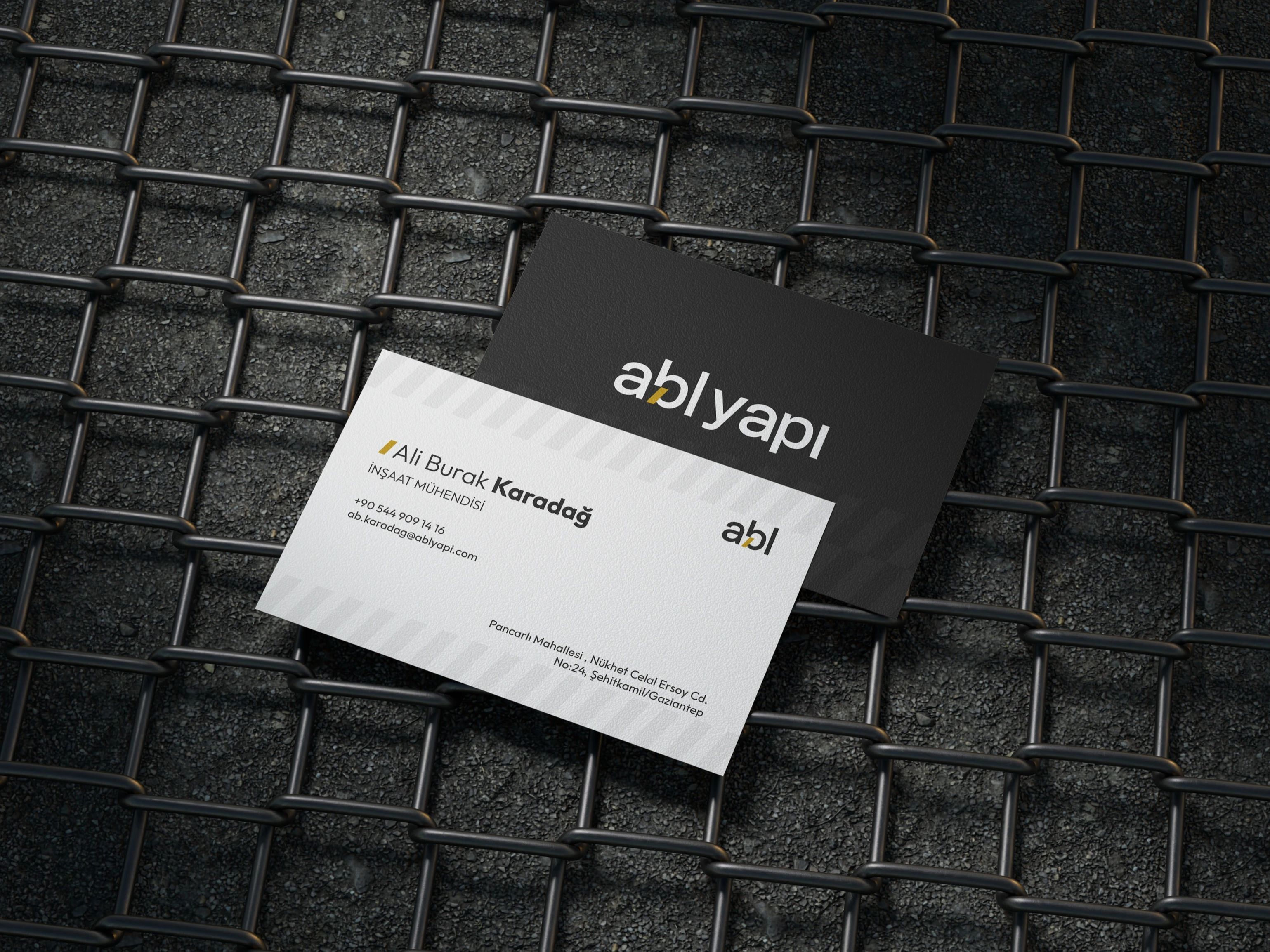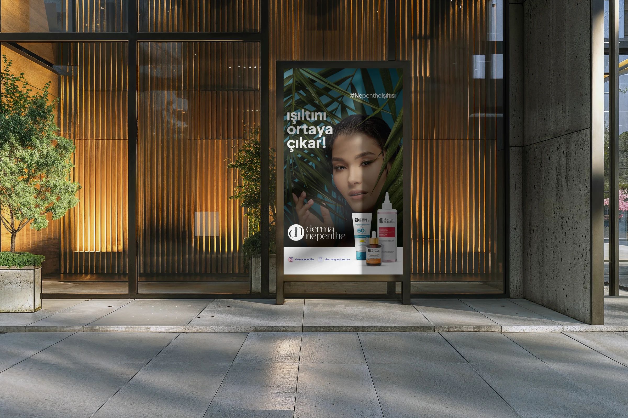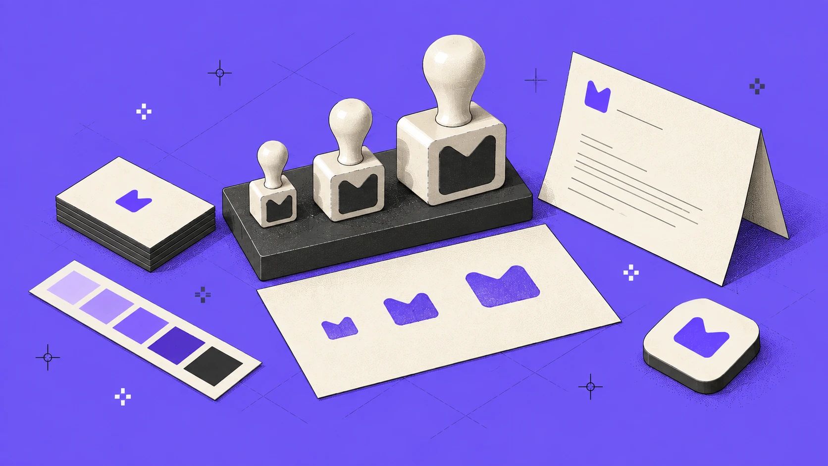
When you think of a brand, its logo comes to mind first. Yet people meet a brand in far more places than its logo: in the 16-pixel icon on a browser tab, on the back of a business card, in a social post that scrolls past, in the corner of an invoice, on a website button.
A corporate identity is the system that lets you recognize the same brand in every one of those encounters. The logo is only one part of it. In this post we break down the parts of an identity, and in the middle we set up a playground where you can watch a single decision spread across every touchpoint.
The parts of an identity
- Mark: The logo and its simplified versions for small sizes: horizontal, stacked and symbol only.
- Color system: The primary color, the tones that accompany it and the job each color does.
- Typography: Typefaces for headings and body, their weights and a type scale.
- Form language: Sharp or round corners, thin or heavy lines, generous or tight spacing.
- Visual language and tone of voice: The style of photos, illustrations and icons; how the brand speaks.
Each of these can be beautiful on its own. What makes an identity strong is the order they create together.
The sizes a single mark lives at
- Browser tab
- 16 px
- The favicon. Often the smallest form a brand takes on screen.
- iPhone home screen
- 180 px
- The icon people see after adding the site to their home screen.
- App Store
- 1,024 px
- The icon size the App Store asks for: 64 times the favicon.
A responsive logo
A logo that works at 1024 pixels doesn’t necessarily work at 16. Thin lines vanish, counters fill in, a long wordmark becomes unreadable. That’s why well-built identities give the mark more than one form: a full logo for wide spaces, a shortened version for narrow ones and a standalone symbol for the smallest sizes.
This site’s logo isn’t a single piece either. The Miova logo has two states: closed, it’s just the M bubble; open, the letters slide out into the full MIOVA wordmark. Both say the same brand; the available space decides which one appears.
Try the rule yourself on the ruler below: shrink the logo, watch where the letters stop being readable, then switch the responsive rule off and on to see the difference.
Interactive
Responsive logo ruler
Drag the ruler to the left. With the rule on, the logo closes down to the mark below 32 pixels; with it off, you’ll see the letters drop under 9 pixels and become impossible to make out.
Drag the ruler or use the arrow keys.
This interactive example isn’t part of the printed version; try it in the online version of this page.
One decision, every surface
The mark is only one part of the system. Decisions like color, corner language and typeface land on every touchpoint at once too. In the playground below, type a brand name and pick a color, a corner style and a typeface; every surface, from the business card to the favicon, changes with the same decision.
Interactive
Brand system playground
Change the brand name, pick a color and a character. The business card, social post, app icon and web interface update from the same decisions. The tonal scale at the bottom shows ten tones derived from one color and the contrast of the text on each.
Identity decisions
Business card
Social post
The autumn menu is served.
See the menuApp icon and favicon
Web interface
Book your table for dinner
Open Tuesday to Sunday, 6 pm to 11 pm.
Letterhead
Dear Ece Kara,
hello@kozde.comModa Cad. No 12, Kadıköy / IstanbulType scale
- Heading 1 · 32Seasonal menu
- Heading 2 · 24Soup of the day
- Body · 16Ember-roasted peppers, fresh thyme and wood-fired bread.
- Small · 12All prices include VAT.
Tonal scale
- 50Aa12.55
- 100Aa11.09
- 200Aa8.86
- 300Aa6.44
- 400Aa3.75
- 500Aa4.43
- 600Aa6.14
- 700Aa8.61
- 800Aa11.98
- 900Aa15.74
Every tone has a job
- Surfacetext on it
- Accentlabel on it
- Linkon white
- Headingon white
The primary color fails AA for body text; links use a darker tone: #795EED
Show tokens
This interactive example isn’t part of the printed version; try it in the online version of this page.
Color system: one color isn’t enough
The primary color is a brand’s signature, but it can’t carry an interface alone. You need light tones for backgrounds, dark tones for text and mid tones for accents. The tonal scale in the demo does exactly that: your color opens up into ten steps in the OKLCH color space, keeping its hue and changing only lightness. “Purple” stops being a single color and becomes a family that works together.
Every family also needs a division of labor. Which color can be used for text and which only for backgrounds isn’t a matter of taste but of contrast. We measured Miova’s own colors on a white background:
Data
Every color has a job
Contrast ratio of Miova’s colors on a white background.
| Category | Contrast on white |
|---|---|
| Charcoal #2C2E2A | 13.71:1 |
| Deep purple #6F55F2 | 4.93:1 |
| Miova purple #876FFF | 3.65:1 |
| Beige #F5F1E4 | 1.12:1 |
The chart draws a clear division of labor: charcoal for text at any size; Miova purple for large headings, buttons and accents (it passes 3:1 but not 4.5:1); deep purple for links in body text; and beige for backgrounds only. Writing this down in the identity guidelines saves you from asking “is this color readable here?” on every project. We explained how contrast is calculated in our legibility post.
Typography and form language
Change the typeface or the corner style in the demo and the brand starts saying something else, even with the same color. A geometric typeface with round corners feels friendly and current; a technical face with sharp corners feels precise and engineering-minded; a classic serif leaves a rooted, trustworthy impression.
That’s why form language needs to be written down as part of the system too: the corner radius of buttons, the stroke weight of icons, the way photos are cropped. Every decision missing from the guidelines will be made differently by the next designer.
Consistency is a discipline
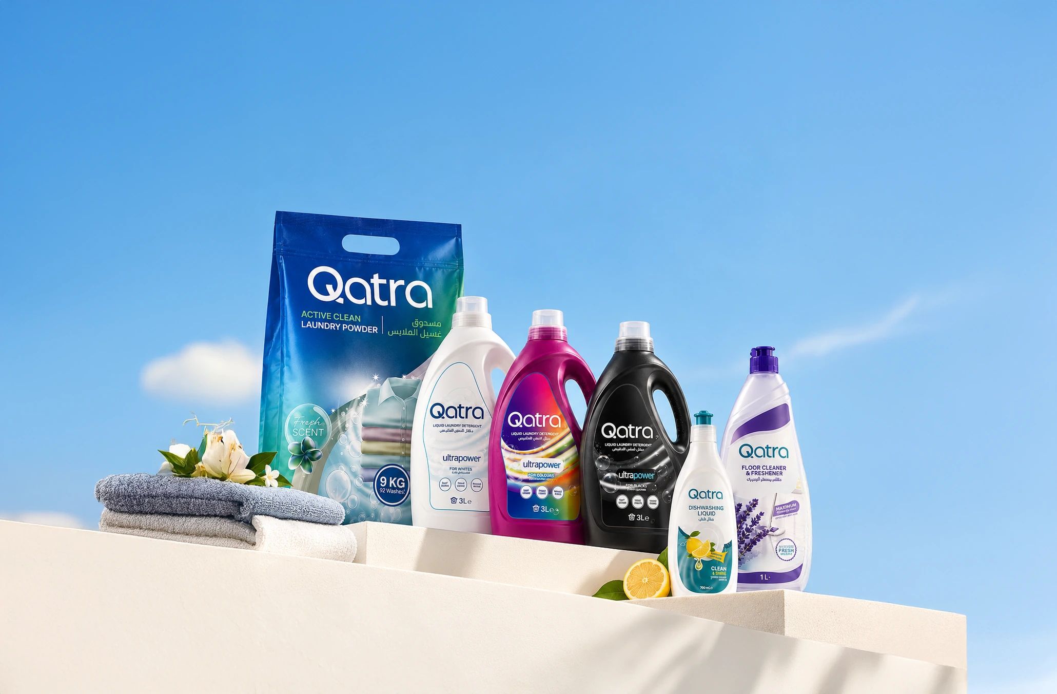
An identity isn’t tested on the day it’s delivered but on its hundredth application: a trade show booth, a presentation template, the side of a shipping box. If the system is built well, no new touchpoint is designed from scratch; it’s solved by combining existing decisions the right way. In the identity we designed for Qatra, the logo, packaging and catalog come from the same visual language, so different product categories stand on the shelf as one family.
A short checklist:
- Does the mark have at least three forms: full logo, shortened logo, standalone symbol?
- Has the primary color been opened up into a tonal family, and does each tone have a job?
- Have the text colors passed a contrast test?
- Are the typefaces, weights and type scale written down?
- Are corner, stroke and spacing rules defined?
- Are the decisions kept under the same names in the design file and in code?
How was this post?