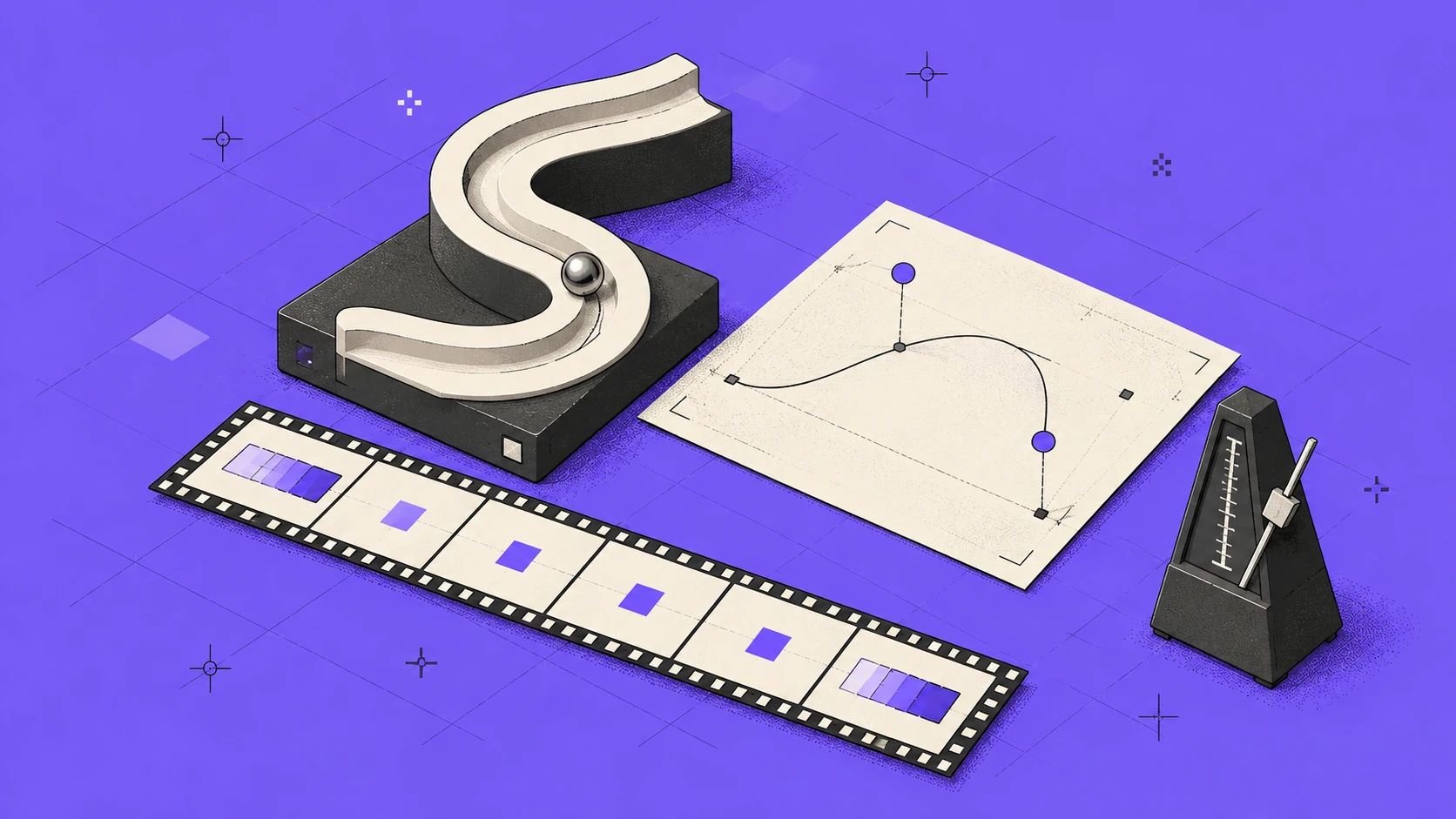
In the physical world nothing speeds up or stops instantly. A door accelerates as it opens, a cup slows down before it touches the table. When an element on screen moves at the same speed from start to finish, our brain reads it as mechanical; we can’t say why, but something feels “cheap”.
Motion in an interface isn’t decoration. It explains where an element came from, where it went and what changed. There are two tools for doing that well: easing and duration.
What is easing?
Easing is how the speed of a movement changes over time. On a graph, the horizontal axis is time and the vertical axis is progress. A straight line means constant speed; the steeper the curve, the faster the movement at that moment.
In CSS the curve is defined with two control points using cubic-bezier(x1, y1, x2, y2):
- Ease-out (start fast, end slow): for elements entering the screen. It responds immediately and settles in gently.
- Ease-in (start slow, end fast): for elements leaving the screen. It takes off and disappears.
- Ease-in-out: for elements moving from point A to point B on screen.
- Linear: only for continuous motion, such as progress bars, spinning loaders and color cycles.
Interactive
Easing playground
Pick a curve or drag the handles. The top ball follows your curve, the bottom one moves linearly, and the notification card enters with the same curve. Try “Linear” first, then “Ease out”, and compare.
--motion-ease: cubic-bezier(0.625, 0.05, 0, 1);--motion-duration: 700ms;Drag the handles, or focus one and use the arrow keys (Shift for bigger steps).
Ticks mark equal slices of time: tight spacing means slow, wide spacing means fast.
This interactive example isn’t part of the printed version; try it in the online version of this page.
Duration: short or long?
The starting point for duration is how people perceive response time. The three limits Jakob Nielsen described in 1993 still hold today.
- Feels instant
- 0.1 s
- Responses under this limit feel like a direct result of the user’s own action.
- Flow of thought
- 1 s
- The user notices the delay, but their flow isn’t interrupted.
- Attention limit
- 10 s
- Beyond this, users turn to other tasks; a progress indicator is a must.
That’s why most interface transitions live between 0.1 and 1 second. Which value to pick depends on the area the motion covers: a small element crosses a short distance quickly, while a large surface takes longer to fill the screen. The durations we used when designing this site follow that principle.
Data
The larger the area, the longer the motion
Default transition durations used across the miova.com.tr interface.
| Category | Duration |
|---|---|
| Menu content fading in | 300 ms |
| Dropdown expanding | 350 ms |
| Menu background morphing | 400 ms |
| FAQ answer opening | 500 ms |
| Header collapsing | 650 ms |
| Page transition | 750 ms |
There’s a second principle: exits are shorter than entrances. When someone closes a menu, they don’t want to watch it disappear; what they care about is the content behind it. Put the opening and closing durations of the same elements side by side and the difference is clear.
Data
Closing is always faster than opening
Durations the same menu elements use when opening and closing.
- Opening
- Closing
| Category | Opening | Closing |
|---|---|---|
| Menu content | 300 ms | 200 ms |
| Dropdown panel | 350 ms | 250 ms |
| Backdrop dimming | 300 ms | 200 ms |
A signature curve
Most of the motion on this site uses the same curve: cubic-bezier(0.625, 0.05, 0, 1). It gathers itself for a moment, moves decisively and quickly, then settles in with a long, calm deceleration. Pick the “Miova” curve in the demo and compare it with the linear reference to see that character.
Using the same curve for the collapsing header, buttons, sliders, the logo animation and the charts in this post makes the site feel as if a single hand shaped it. Users don’t know the curve’s name, but they feel the consistency.
Respecting reduced motion
For some people, large motion on screen means dizziness or nausea. The operating system’s “reduce motion” setting reaches the browser as prefers-reduced-motion, and it deserves respect: remove sliding, parallax and large scale changes, and keep at most a short opacity fade. The charts and counters in this post also appear in their final state, without animation, when that setting is on.
Don’t forget performance either: animate with transform and opacity. Animating width, height, top or left forces the browser to recalculate layout on every frame and stutters, especially on mobile.
A short checklist
- Ease-out for entering elements, ease-in for leaving ones.
- Small elements move briefly, large surfaces take longer.
- Closing is shorter than opening.
- Give motion seen a hundred times a day less time, or none at all.
- If the motion doesn’t explain anything, remove it.
How was this post?